
All Categories :
Java
Chapter 18
Programming Applets
by Rogers Cadenhead
CONTENTS
The proliferation of windowing software in the past five years,
led by Microsoft Windows and Apple Macintosh systems, has created
an expectation among users that software should make use of these
features. In Java, windowing and other graphical user interface
functions are handled by the Abstract Windowing Toolkit (AWT).
The AWT is one of the most useful packages included with the Java
API. The AWT is a set of classes used to build a graphical user
interface for Java applications and applets. It enables programmers
to easily create the following features for programs:
- Windows and dialog boxes
- Pull-down menus
- Buttons, labels, checkboxes, and other
simple user interface components
- Text areas, scroll bars, and other more
sophisticated user interface components
- Layout managers to control the placement
of user interface components
The AWT also includes classes to handle graphics, fonts, and color
in Java programs, and an Event
class to enable programs to respond to mouse clicks, mouse movements,
and keyboard input.
Today, the Java Developers Kit (JDK) is not the only choice available
to programmers. There are numerous ways to develop a graphical
user interface for Java programs, such as SunSoft Java WorkShop
and Rogue Wave JFactory. Java WorkShop includes a Visual Java
tool for the drag-and-drop development of windows, dialog boxes,
and other elements that are common to windowing systems. JFactory
is an interface builder that can be used with different Java programming
environments.
However, there are several reasons to begin learning about interface
development by using only the AWT. First, it's still the most
commonly used interface designer for Java, so the majority of
source code that's publicly available uses AWT classes to control
its interface. Second, many of the other windowing design systems
use the AWT as the underlying code to handle the interface.
This chapter focuses on how the AWT can be used in the development
of applets. However, the same methods apply to the creation of
applications. Many of these features and additional aspects of
Java interface programming are covered in Chapter 16,
"The Windowing (AWT) Package."
When you use the Abstract Windowing Toolkit, you make up the graphical
user interface with components. Each element you can manipulate
with a windowing program is represented by its own component.
There are components for buttons you can press, components for
text fields you can type into, and components for scroll bars
you can control. There also are components for some things you
cannot directly manipulate, such as labels-lines of text used
on an interface, such as the words Enter
password: next to a text field on a login window.
To use these components in a program, you must put them into some
kind of container. A container is a blank slate where graphical
user interface components can be put. All containers in Java are
subclasses of the Container
class.
There are two basic types of containers:
- The Window
class: Pop-up windows separate from the main program. There
are two subclasses of Window:
Frame (windows that have
a border and menu bar) and Dialog
(a special window used in applications to select a file).
- The Panel
class: A container that represents a section of an existing
window. The Applet class
is a container that is a subclass of the Panel
class. You can place components directly on an applet or use Panel
objects to subdivide the applet into smaller sections.
A Panel container is not
visible when it is added to an applet. Its purpose is to provide
a way to organize components when they are being laid out in a
window.
Listing 18.1 is the full source code for an applet that has a
new Panel added to its surface.
It does not produce any output other than a blank window. However,
it is useful as a template for the components you will learn to
add throughout this chapter. This file-and all the other listings
in this chapter-are included on the CD-ROM that accompanies this
book in the /SOURCE/CHAP18
subdirectory.
Listing 18.1. The source code of Sample.java.
1: import java.awt.*;
2:
3: public class Sample extends java.applet.Applet {
4:     Panel p = new Panel();
5:
6:     public void init() {
7:         add(p);
8:     }
9: }
The method call that puts the Panel
object p on the applet window
is the statement add(p);.
The add() method is used
whenever a component of any kind is added to a container.
By replacing the line Panel p = new Panel()
with the variable declarations of components you will create,
and replacing the line add(p);
with the components to be added to a container, you can use this
source code to try each component out.
By default, components are added to a container in left-to-right,
top-to-bottom order. If a component does not fit on a line, it
is placed at the leftmost edge of the next line. You can control
how components are organized by using a layout manager, as you
learn later in this chapter. Until then, the examples use the
default layout style.
Buttons
The Button component is a
rectangular button that can be pushed by clicking it with a mouse.
Figure 18.1 shows an example of a simple one-button applet.
Figure 18.1: A Button Component.
The following code is used to create a Button
component and add it to an applet window:
Button b = new Button("Cancel");add(b);
The add(b) method does not
refer to a specific container object, so it defaults to the applet
itself, adding the button to the applet surface. If you wanted
to create a new Panel and
add a new Button component
to that panel, use the following code:
Panel p = new Panel();
Button b = new Button("Send");
p.add(b);
Text Fields
The TextField component is
an input box in which a user can type a single line of text. The
number of characters that can be visible in the text field is
configurable. Figure 18.2 shows an example of an applet with a
text field.
Figure 18.2: A TextField component.
The following code is used to create a TextField
component and add it to an applet window:
TextField t = new TextField(12);
add(t);
The parameter 12 in the constructor
TextField(12) sets up the
text field so that around 12 characters can be displayed in the
field at one time. The user can type more characters than that,
but only some of the characters will be displayed.
If a string is specified as a parameter to the constructor, as
in the statement TextField t = TextField("your
name"); the text field is created with the string
as the default text in the input area of the field.
You can specify default text and a width at the same time by using
a statement such as the following:
TextField country = new TextField("United States", 20);
Labels
The Label component is a
string of text displayed on the container; it cannot be modified
by the user. Figure 18.3 shows an example of an applet with a
label next to a text field.
Figure 18.3: A Lable component to the left of a text field.
The following code is used to create a Label
component and add it to an applet window:
Label l = new Label("E-mail address: ");
add(l);
The parameter in the constructor Label("E-mail
address: ") identifies the text to be displayed.
Checkboxes
The Checkbox component is
a toggle box that can be either selected-marked with a checkmark-or
unselected. The checkbox usually has a line of text next to it
explaining what the box signifies. Figure 18.4 shows an example
of an applet with a checkbox.
Figure 18.4: A checkbox component.
The following code is used to create a Checkbox
component and add it to an applet window:
Checkbox c = new Checkbox("Never Mind");
add(c);
The parameter in the constructor CheckBox("Never
Mind") identifies the text to be displayed. If
you omit this parameter, a checkbox is displayed without any text
next to it.
A checkbox is often used with a group of related checkboxes so
that only one of the boxes can be selected at one time. To group
checkboxes together, you use the CheckboxGroup
class. The setCheckboxGroup()
method associates a checkbox with a particular group; the setCurrent()
method of CheckboxGroup can
be used to make one of the boxes the selected box. The following
code shows the use of CheckboxGroup:
CheckboxGroup cbg = new CheckboxGroup();
Checkbox c1 = new Checkbox("To-MAY-to");
c1.setCheckboxGroup(cbg);
add(c1);
Checkbox c2 = new Checkbox("To-MAH-to");
c2.setCheckboxGroup(cbg);
add(c2);
Checkbox c3 = new Checkbox("Let's call the whole thing off.");
c3.setCheckboxGroup(cbg);
cbg.setCurrent(c3);
add(c3);
Figure 18.5 shows this applet with the third checkbox selected.
Figure 18.5: A group of checkbox components.
Choice List
The Choice component is a
pop-up list of strings from which a single string can be selected.
Its function is similar to a group of checkboxes because a choice
list provides a group of options and enables one to be selected.
Figure 18.6 shows an example of an applet with a choice list.
Figure 18.6: A choice component.
The addItem() method of the
Choice class is used to build
the choice list. The following code is used to create a choice
list, add items to it, and then add the list to an applet window:
Choice c = new Choice();
c.addItem("Victor");
c.addItem("Hugo");
c.addItem("Laverne");
add(c);
Up to this point, all the components have been added to a container
in a manner similar to the way HTML elements are arranged on a
Web page. Things are loosely organized from left to right and
top to bottom, and the look of the container is highly dependent
on the size of its display area.
This approach fits Java's requirement to be multiplatform. Because
the language must work on any system that has a Java implementation,
the windowing environment must be flexible. The Java applet you
program looks dramatically different when shown on a Windows 95
system, a Macintosh system, and a SPARC workstation.
However, Java has a system of organizing user interface components
that makes it possible for your applet's interface to work on
each of the platforms-and to look close enough in appearance on
different platforms to operate reliably. These organization tools
are called layout managers.
When you added components to a container-the main applet window-in
each of the previous examples, you were using the default layout
manager: a class called FlowLayout.
There are three other layout managers you can use as you organize
your interface: BorderLayout,
GridLayout, and GridBagLayout.
To start using a layout manager for a container, call the setLayout()
method before you add any components. This approach is further
described in the following sections.
The FlowLayout
Class
The FlowLayout class is the
default layout manager for all Panels-including
the Applet class-and it is
the one that's the simplest to use. Components placed under the
rules of FlowLayout are arranged
in order from left to right. When a component is too big to be
added to the current row, a new line of components is begun below
the first line.
Each row of components can be aligned to the left, right, or centered.
The only parameter used with the add()
method is the name of the object to add.
The following setLayout()
statement sets up a container to use the FlowLayout
manager:
setLayout( new FlowLayout() );
Figure 18.7 shows an example of an applet with all components
arranged according to the rules of the FlowLayout
manager.
Figure 18.7: Components arranged by the FlowLayout manager.
The BorderLayout
Class
The BorderLayout class is
the default layout manager for all Window,
Dialog, and Frame
classes. In a border layout, components are added to the edges
of the container and the center area is allotted all the space
that's left over. The add()
method takes an additional parameter-a string that can be North,
South, East,
West, or Center.
This parameter specifies the location in the border layout for
the component. For example, the following statements create five
buttons and add them to a container laid out with the BorderLayout
manager:
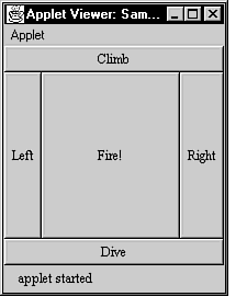
Button b1 = new Button("Climb");
Button b2 = new Button("Dive");
Button b3 = new Button("Left");
Button b4 = new Button("Right");
Button b5 = new Button("Fire!");
setLayout( new BorderLayout() );
add("North", b1);
add("South", b2);
add("West", b3);
add("East", b4);
add("Center", b5);
The setLayout( new BorderLayout() );
statement shows the use of the setLayout()
method to select a layout manager for the container. Figure 18.8
shows the resultant applet. Be sure to correctly capitalize the
directional parameter to the add()
method -unlike other aspects of the language that are not case
sensitive, BorderLayout requires
the directions to be capitalized consistently as North,
South, East,
West, and Center.
Figure 18.8: Components arranged by the BorderLayout manager.
The GridLayout
Class
The GridLayout class puts
each component into a spot on a grid and makes each component
equal in size. The grid is given specific dimensions when created,
and each component is added to the grid in order, starting in
the upper-left corner. This is similar to the way that components
are added according to the rules of FlowLayout,
but with GridLayout, components
are given equal amounts of space on the container.
Components placed under the rules of GridLayout
are arranged in order from left to right. When there are no more
grids remaining on a row, the next component to be added is placed
in the leftmost grid on the next line, if one is available. The
only parameter used with the add()
method is the name of the object to add.
The following setLayout()
statement sets up a container to use the grid layout manager with
four rows and six columns:
setLayout( new GridLayout(4, 6));
Figure 18.9 shows an example of an applet with all components
arranged according to the rules of the GridLayout
manager.
Figure 18.9: Components arranged by the GridLayout manager.
The GridBagLayout
Class
The GridBagLayout class is
similar to the GridLayout
manager except that GridBagLayout
provides much more control over how the grid is organized and
how components are presented. Cells in the grid are not required
to take up the same amount of space, and components can be aligned
in different ways in each grid cell.
A special GridBagConstraints
object is used to determine how a component will be placed into
a cell and how much space that cell will occupy. Unlike the FlowLayout
and GridLayout managers,
with the GridBagLayout manager,
components can be added to the grid in any order.
The first step needed to use a GridBagLayout
is to set up the layout and the GridBagConstraints
object, as shown here:
GridBagLayout gl = new GridBagLayout();
setLayout ( gl );
GridBagConstraints gb = new GridBagConstraints();
Before a component can be added to the container, instance variables
of the GridBagConstraints
object are used to determine the component's location and alignment
within its grid cell.
The following GridBagConstraints
variables can be set:
- gridx and gridy:
These variables specify the cell in the grid where the component
should be placed. gridx represents
the rows, and gridy represents
the columns. The (1,1) position
is in the upper left corner.
- gridheight and gridwidth:
These variables specify the number of cells a component should
occupy. gridheight determines
the number of rows, and gridwidth
determines the number of columns.
- fill: This variable specifies
the directions in which a component should expand if it has room
to grow inside its cell. This can happen because of larger components
in other cells. The constants GridBagConstraints.HORIZONTAL,
GridBagConstraints.VERTICAL,
GridBagConstraints.BOTH,
and GridBagConstraints.NONE
can be used with this variable. The following is an example of
a statement that sets the fill
variable:
gb.fill = GridBagConstraints.BOTH;
- anchor: This variable
specifies the way a component should be aligned in its cell. The
following GridBagConstraints
constants can be used: NORTH,
NORTHEAST, EAST,
SOUTHEAST, SOUTH,
SOUTHWEST, WEST,
NORTHWEST, CENTER.
Following is an example that places a component using the GridBagLayout
manager:
// declare variables
GridBagLayout gl = new GridBagLayout();
GridBagConstraints gb = new GridBagConstraints();
Label l1 = new Label("Full e-mail address:");
// choose a layout manager
setLayout ( gl );
// set up the constraints
gb.gridx = 1;
gb.gridy = 2;
gb.gridwidth = 2;
gl.setConstraints(l1, gb);
// set up the component
l1.setAlignment(Label.RIGHT);
// add the component
add(l1);
In this example, the component is placed in row 1 and column 2
of the grid, and the component takes up two cells in width.
Figure 18.10 shows an example of an applet with all components
arranged according to the rules of the GridBagLayout
manager.
Figure 18.10: Components arranged by the GridBagLayout manager.
Nested Panels
Although the Abstract Windowing Toolkit offers several different
kinds of layout managers, there are many times when one specific
manager does not fit the user interface you are trying to create.
The solution to this problem is to nest one type of container
inside another so that the nested container can use one type of
layout manager, and the larger container can use another.
You can nest containers as many times as needed: containers can
contain other containers, and each can use its own layout manager.
The following code creates a container that uses the BorderLayout
manager and then adds a panel of choice boxes to that container.
Because no layout manager is specified for the buttons, they default
to the FlowLayout manager:
setLayout( new BorderLayout() );
Button b1 = new Button("Purchase");
add("North", b1);
Button b2 = new Button("Exit");
add("West", b2);
Button b3 = new Button("Help");
add("East", b3);
Button b4 = new Button("Browse Catalog");
add("South", b4);
Panel p = new Panel();
// add check boxes to panel
Checkbox c1 = new Checkbox("Brazil: $9.95");
p.add(c1);
Checkbox c2 = new Checkbox("Time Bandits: $12.95");
p.add(c2);
Checkbox c3 = new Checkbox("12 Monkeys: $39.95");
p.add(c3);
// add panel to main container
add("Center",p);
Figure 18.11 shows the applet that uses this code. Using nested
panels and different types of layout managers makes it possible
to create many different types of user interface windows.
Figure 18.11: A container organized by the BorderLayout manager with a nested panel in the center organized by the Flowlayout manager.
In addition to the components you have learned to create up to
this point, the AWT offers some more sophisticated elements such
as text areas, scrolling lists, and scroll bars.
Text Areas
The TextArea component is
an extended input box that enables more than one line of text
to be entered. The number of lines and the number of characters
per line that are visible in the text area are configurable. Figure
18.12 shows an example of an applet with a text area.
Figure 18.12: A TextArea component.
The following code is used to create a TextArea
component and add it to an applet window:
TextArea t = new TextArea(5,20);
add(t);
The parameters 5 and 20
specify the text area's number of lines and the number of characters
per line, respectively. If the text extends beyond the borders
of the text area, a scroll bar appears to enable the user to scroll
to the different sections of the text area.
If a string is specified as a parameter to the constructor, as
in the statement TextArea t = TextArea("It
was a dark and stormy night.", 7, 25); the text
area is created with the string as the default text in the input
area of the field. To cause parts of this text to start at the
beginning of the next line, use a newline character (\n)
in the text of the parameter. For example, to put the text stormy
night. at the beginning of a new line, use the following
statement:
TextArea t = TextArea("It was a dark and\nstormy night.", 7, 25);
Scrolling Lists
The List component is a scrolling
list of strings from which one or more strings can be
selected. Figure 18.13 shows an example of an applet with a scrolling
list.
Figure 18.13: A List component.
The addItem() method of the
List class is used to build
the scrolling list. The following code is used to create a scrolling
list, add items to it, and then add the list to an applet window:
List l = new List(3,true);
l.addItem("Captain America");
l.addItem("Superman");
l.addItem("Cerebus");
l.addItem("Nexus");
add(l);
The List() constructor can
be used with no parameters or with two parameters; the List
l = new List(3, true); statement uses two parameters.
The first parameter indicates the number of list items to display
in the list window; the second parameter determines how many list
items can be selected. If the second parameter is true,
multiple items can be selected. Otherwise, only one choice from
the list can be made.
Scroll Bars
The Scrollbar component is
an up-down or left-right slider that can be used to set a numeric
value. The component can be used by clicking the mouse on an arrow
or grabbing the box on the slider. Figure 18.14 shows an example
of an applet with a scroll bar.
Figure 18.14: A Scrollbar component.
The first parameter of the Scrollbar
constructor determines whether it is a vertical or horizontal
scroll bar. If you want the bar to be vertical, use the constant
Scrollbar.VERTICAL. Otherwise,
use the constant Scrollbar.HORIZONTAL.
There are four other parameters that follow the alignment parameter.
These parameters determine the slider's initial setting, the size
of the scrollable area, the minimum value, and the maximum value.
Consider the following statement:
Scrollbar sb = new Scrollbar(Scrollbar.HORIZONTAL, 50, 30, 10, 90);
This creates a horizontal Scrollbar
component with the slider initially set to 50. The visible part
of the scrollable area has a value of 30 from one end to the other.
The minimum value when the slider is all the way to the left is
10, and the maximum value when the slider is all the way to the
right is 90.
The following code is used to add a scroll bar to an applet window:
Scrollbar s = new Scrollbar(Scrollbar.HORIZONTAL,50,100,1,100);
add(s);
Canvases
The Canvas component is a
section of a window used primarily as a place to draw graphics.
In that respect, it is more similar to a container than a component-however,
a Canvas cannot be used as
a place to put components. Figure 18.15 shows an example of a
canvas, which appears as a white area on a darker applet background.
Figure 18.15: A canvas Component.
The following code is used to create a Canvas
component, resize it to 50-by-50 pixels, set the background of
the canvas to the color white, and add the canvas to an applet
window:
Canvas c = new Canvas();
c.resize(50,50);
c.setBackground(Color.white);
add(c);
At this point, you have the tools necessary to build an impressive
graphical user interface for a Java applet. You can use text fields
to enter characters, click buttons, move scroll bars from side
to side, and so on.
However, the interface has no way to respond to any of this user
input. In a windowing environment such as the one provided by
the Abstract Windowing Toolkit, user input-whether from the mouse,
keyboard, or other means-generates an event.
An event is a way for a program to communicate that something
has taken place. Events generate automatic calls to methods in
the same way that a paint()
method can be called automatically when an applet window has to
be redrawn, or an init()
method is called automatically when an applet is first run.
Events can involve a user interface element-such as a button that
has been clicked. Events can also be something unrelated to the
interface-such as an error condition that causes the program to
stop execution.
In Java, the class java.awt.Event
handles all events related to the user interface.
For the purpose of controlling the user interface components you
can create for use with applets, there are two kinds of events
to consider: action events and scroll-list events.
Action Events
An action() event is generated
by most user interface components to signify that an event has
taken place. This means different things depending on the component:
- For buttons, an event means that the button
has been clicked.
- For checkboxes, an event means that the
box has been selected or deselected.
- For lists or choice lists, an event means
that one of the list items has been selected.
- For text fields, an event means that the
Enter key has been pressed to indicate that user input is completed.
The action() method of the
Event class takes the following
form:
public boolean action(Event e, Object o) {
    // method code here
}
All user interface components that generate an action event do
so by calling the action()
method. To determine which component generated the event-and to
gather some other information about what occurred-there are two
parameters to the action()
method: an instance of the Event
class and an Object.
The Event class has several
instance variables that provide information about the event that
has taken place. The one you use most with action()
events is the target variable,
which indicates which component generated the event.
The code in Listing 18.2 creates three buttons on an applet window
and sets a TextField in response
to the button that was pressed. You can also find this code on
the CD-ROM that accompanies this book. Windows 95 and Windows
NT 4 users will find the code for this chapter in
\WIN95NT4\SOURCE\CHAP18. Macintosh users will find
code in \SOURCE\CHAP18. Windows
NT 3.51 users must install the source code to their hard drives
or select the files from the zipped source code on the CD-ROM.
Listing 18.2. The full source code of Buttons.java.
 1: import java.awt.*;
 2:
 3: public class Buttons extends java.applet.Applet {
 4:     Button b1 = new Button("Swing Away");
 5:     Button b2 = new Button("Bunt");
 6:     Button b3 = new Button("Renegotiate Contract");
 7:     TextField t = new TextField(50);
 8:
 9:     public void init() {
10:         add(b1);
11:         add(b2);
12:         add(b3);
13:         add(t);
14:     }
15:
16:     public boolean action(Event e, Object o) {
17:         if (e.target instanceof Button) {
18:             String s = (String)o;
19:             if ( s.equals("Swing Away") )
20:                 t.setText("A long fly to center ... caught.");
21:             else if ( s.equals("Bunt") )
22:                 t.setText("You reach on a throwing error!");
23:             else
24:                 t.setText("You're now America's newest multimillionaire!");
25:         }
26:         return true;
27:     }
28: }
To test the applet, create an HTML file with the source code from
Listing 18.3 (this code is also found on the CD-ROM that accompanies
this book).
Listing 18.3. The HTML source code of Buttons.html.
1: <html>
2: <body>
3: <applet code="Buttons.class" height=100 width=475>
4: </applet>
5: </body>
6: </html>
Figure 18.16 shows this applet being run.
Figure 18.16: The Buttons applet.
Scroll Bar Events
The action() method is generated
by every component described in this chapter except for one: Scrollbar.
The Scrollbar component uses
the handleEvent() method.
The handleEvent() method
of the Event class takes
the following form:
public boolean handleEvent(Event e) {
    // method code here
}
Unlike the action() method,
handleEvent() takes only
one parameter: an instance of the Event
class. Using the target variable
of the Event class, you can
determine which component generated the event and respond to it.
The following example sets a value in a text field based on user
input to a scroll bar. To try it out, type the code in Listing
18.4 into a text editor and save it as Scroller.java
(alternatively, you can copy the code from the CD-ROM that accompanies
this book).
Listing 18.4. The full source code of Scroller.java.
 1: import java.awt.*;
 2:
 3: public class Scroller extends java.applet.Applet {
 4:     Scrollbar s = new Scrollbar(Scrollbar.HORIZONTAL,
 5: 			      50,100,0,100);
 6:     Label l = new Label("Choose Your Own Tax Rate: ");
 7:     TextField t = new TextField("50%", 3);
 8:
 9:     public void init() {
10:         add(s);
11:         add(l);
12:         add(t);
13:     }
14:
15:     public boolean handleEvent(Event e) {
16:         if (e.target instanceof Scrollbar) {
17:             int taxrate = ((Scrollbar)e.target).getValue();
18:             t.setText(taxrate + "%");
19:             return true;
20:         }
21:     return false;
22:     }
23: }
Compile the file and create a Web page to put the applet on. Enter
the code in List-
ing 18.5 and save it as Scroller.html
(you can also find this code on the CD-ROM that accompanies this
book).
Listing 18.5. The HTML source code of Scroller.html.
1: <html>
2: <body>
3: <applet code="Scroller.class" height=200 width=200>
4: </applet>
5: </body>
6: </html>
When you use a Web browser or the applet viewer JDK utility to
view the page, it should resemble Figure 18.17.
Figure 18.17: The Scroller applet.
This introduction to applet programming and the Abstract Windowing
Toolkit showed you that a lot of Java's functionality is built
into its class libraries. For many applets, creating the user
interface represents the bulk of the work because a lot of the
code needed to control the interface has already been written.
Each of the user interface components has methods you can use
to retrieve or change their values, enable or disable their operation,
and perform other tasks. The full reference to these methods is
available in the Java API documentation that comes with the Java
Developers Kit.
Once you have acquired some experience developing applets with
the AWT, you will be in a much better position to take advantage
of the other visual programming tools that have been introduced
for Java.

Contact
reference@developer.com with questions or comments.
Copyright 1998
EarthWeb Inc., All rights reserved.
PLEASE READ THE ACCEPTABLE USAGE STATEMENT.
Copyright 1998 Macmillan Computer Publishing. All rights reserved.

 SHOPPING
 JOB BANK
 REFERENCE
 JOURNAL
 COMMUNITY
 ABOUT US